
Care.com is an online platform that helps families connect with trusted caregivers in child care, day care, au-pairs, senior care, pet care, special needs, tutoring, and housekeeping. Care’s mission is to help every family in all stages of care.
Care.com is based in Austin, Texas in the US, and has an international headquarter in Berlin, Germany. The company offers its services in the US and internationally in markets such as Canada, UK, Germany, France, Austria, Australia, Switzerland, and more.
INTERNATIONAL ONBOARDING
Due to a shortage of resources, the international Care product hasn’t been given the update it has needed for a long time. With the many features that needed an uplift, my team and I agreed that the change needed to begin at the very start of our user’s journey on the platform.
WHAT
UX/UI
Design workshop
Research
Testing
Team
Lead Designer — Myself
Product Manager
Engineers (4)
DURATION
4 Months
Launch date
In-development 2022-2023
Device
Responsive web
TOOLS
Figma
Miro Board
PlayBookUX
JIRA
OBJECTIVE
To redesign the caregiver’s first impression on the platform, the onboarding experience of Care.com. This is the first journey that our caregivers experience in creating a profile to promote themselves for jobs. This design and UX has been outdated since the early 2000’s and needed a fresh update to align with our current design library system, overall branding, and best UX practices.
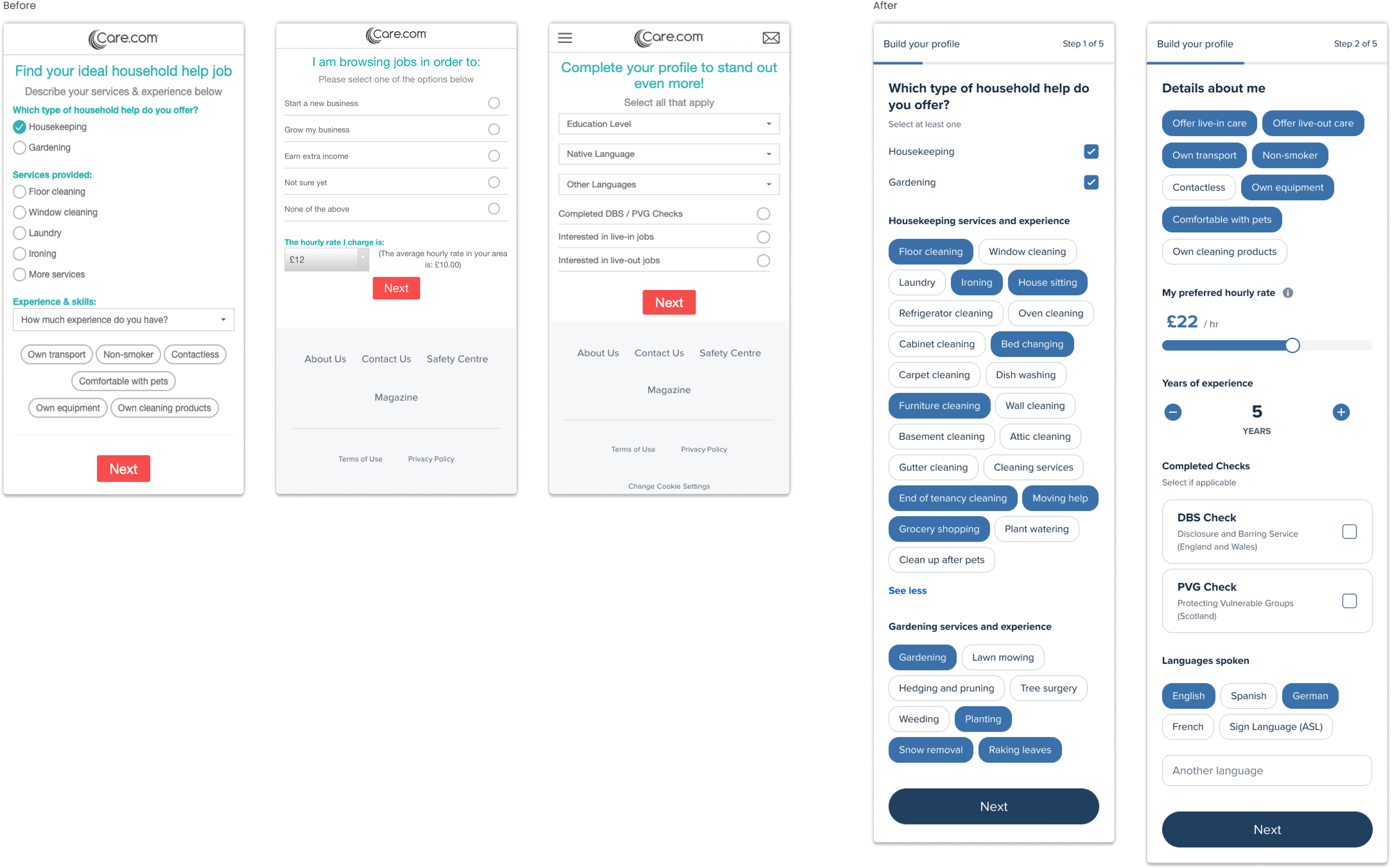
Through many internal changes, a number of updates were never built or published and therefore the site doesn’t appear as cohesive as expected. With this redesign, we hope to increase our quality of caregivers in our network. To start, we focused on our UK market - specifically our housekeeping vertical (the second most revenue generating vertical, childcare being our first). The next plan will be to incorporate top performing changes into our childcare onboarding flow.
Challenge
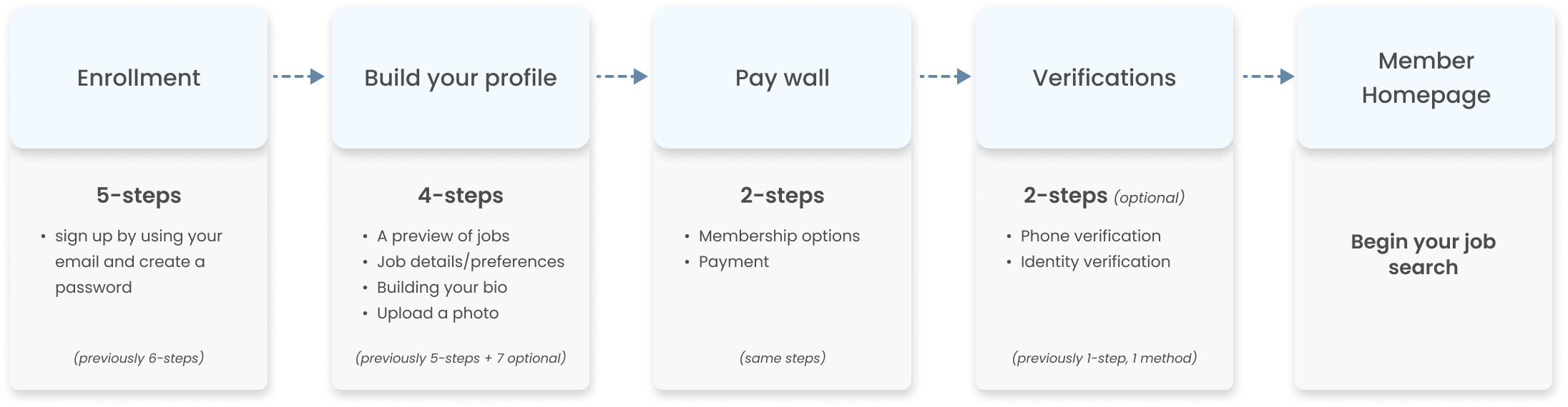
The outdated flow felt long and tedious to users as there was no way to know how many steps it would take to complete before finding a job. The UI was mixed with some slight updates, but mostly old designs which made the experience feel unprofessional and broken.
In 2021, we saw a decline month after month in profile completion rate, from 58% to about 50%. (Childcare ~57%, Housekeeping ~46%). Meanwhile, we began seeing a heavy increase in jobs created by families.
the UPDATED flow breakdown
RESEARCH
What we know
45% caregivers did not know how to share or how to explain their past experiences in order to get hired
45% users drop off at bio creation step
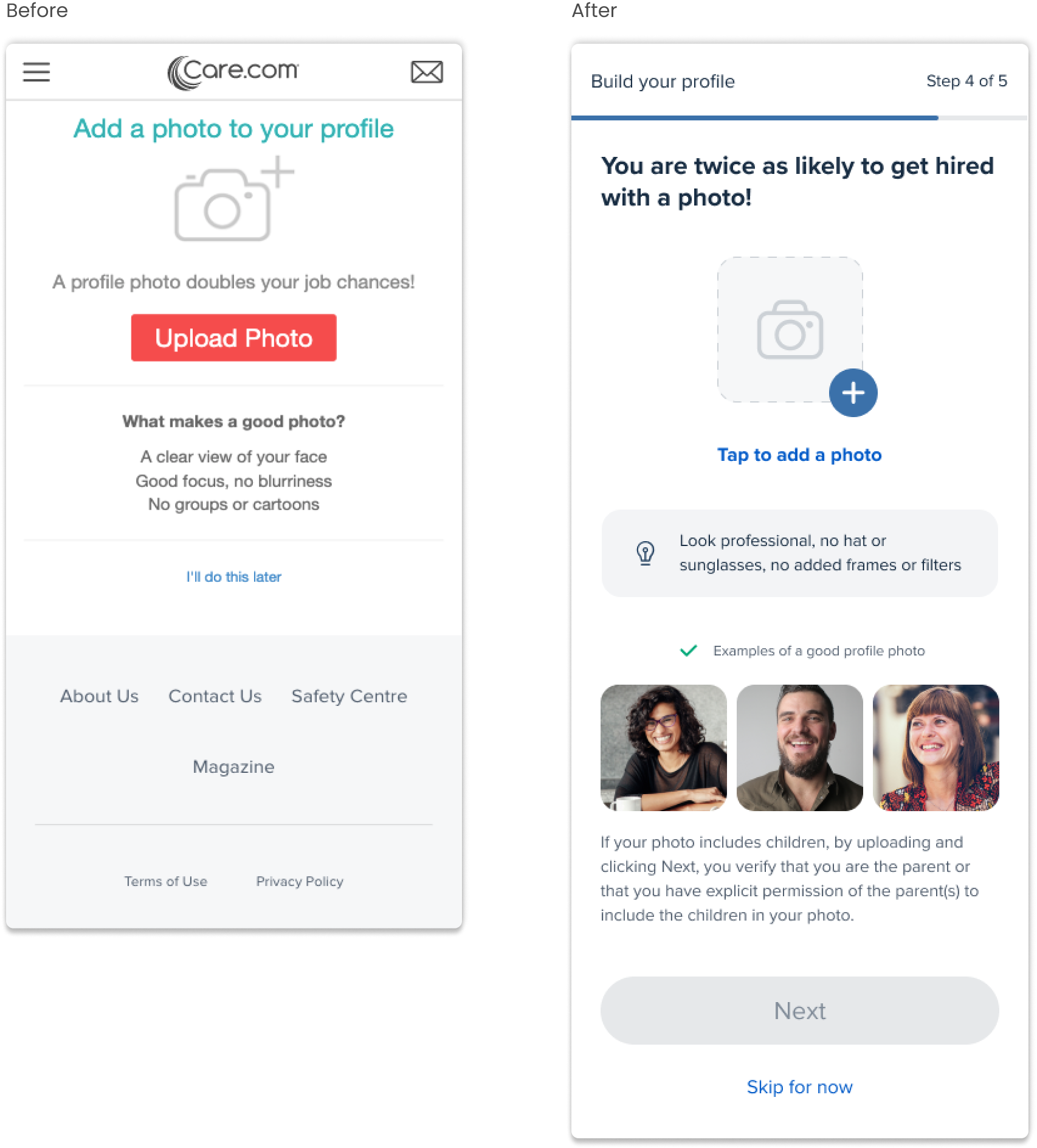
80% users skipped photo upload screen
45-50% of all basic members (caregivers) never enter the required information needed to become a complete member, therefore they are not seen by families in search
Many users find the onboarding flow to be too long and tedious to complete
Users do not know the value of our product upfront
USER TESTS
I conducted a total of 5 sets of user tests (with at least 5-8 candidates each) with our English speaking markets, the UK and Canada for the housekeeping vertical. The first test was to see how users would react to the newly updated UX/UI of the flow. The following tests were inspired by our findings.
Test 1: Testing the first UX/UI design iteration of the entire flow with users
Test 2: Identifying ways to help our users create a bio
Test 3: Utilizing question cards to help users write their bio (Part I)
Test 4: Utilizing question cards to help users write their bio (Part II)
Test 5: Learning the family’s point of view in hiring a caregiver
High-level findings
Introducing a numbered step tracker to the top of the page helped set expectations to users
Users mostly struggled in writing about themselves for their bio and wanted more guidance
Users wanted visual guidance to know what makes a great profile photo
Seeing a preview of potential jobs is helpful to understand the value of the membership they’re signing up for
Question cards are helpful in building their bio and provided more confidence to users to complete the task
(To read more about my research, you can view this deck.)
MAJOR CHANGES
Profile details
bio creation
Our user tests validate that question cards helped our users to be more successful in writing about themselves than providing blank textfields. Not only does this help our caregivers, but we discovered that formatting their bios in a question and response layout helped our families to read through responses quicker and locate keywords more easily when reviewing a caregiver’s profile.
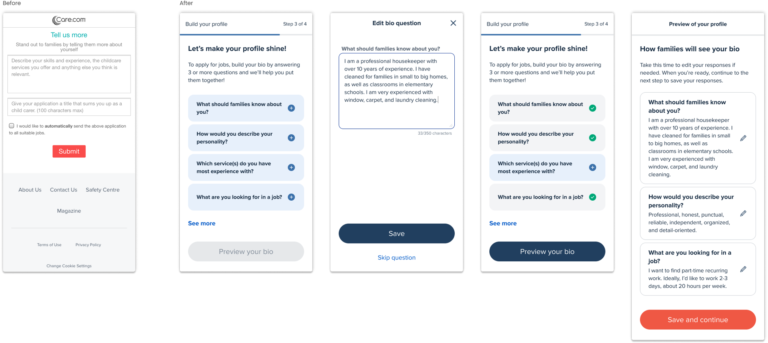
photo upload
Not only did providing a visual guide help increase our user’s confidence in understanding what makes a good profile photo — our headline also encouraged our users to know why it’s important to do so.
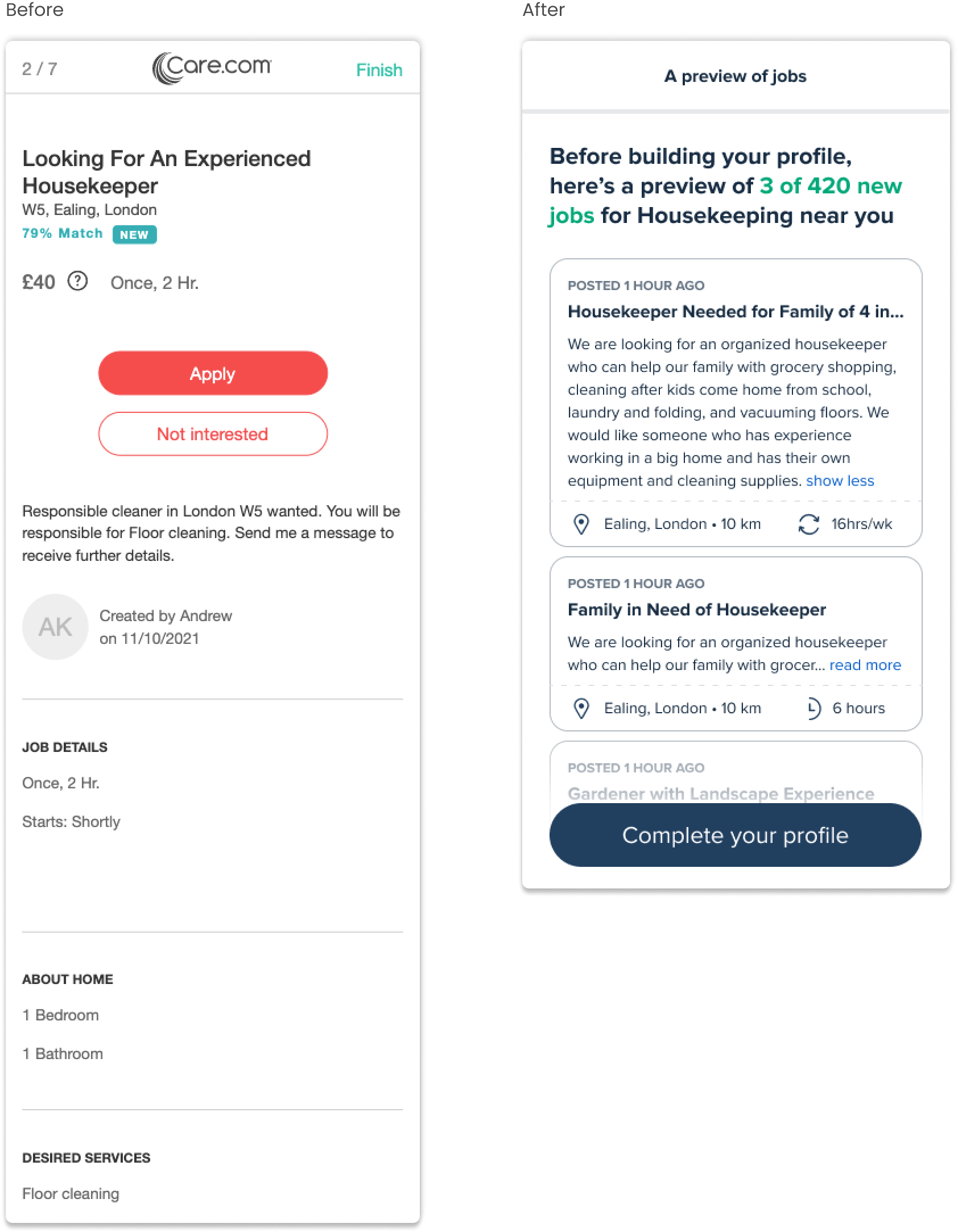
job preview
Previously, users were shown 7 jobs in which they were able to apply to right after their bio was written. When we tested this again, users expressed that this was too premature during this process as they haven’t had a chance to explore the platform yet. My solution was to eliminate this step and swap in a preview of 3 jobs to begin educating users with what to expect.
Next steps
To ensure that our engineering team is able to build our MVP in time, I’ve split the entire design into 6 phases of release. Within each phase, we’ll build out a major feature. This way, it allows our team to better manage expectations, have room for QA time, and incorporate any last minute iterations if needed.
During these release phases, we will measure our conversion and completion rates by A/B testing the control and new designs. We will launch the new experience in only the UK, as they are one of our smaller markets. This will act as a test run to see how it performs before releasing it to all other international markets.